THE GOAL
Maintaining both a professional and friendly appearance was important for our client so that their brand was approachable and accessible for a wide audience for both partners and Women of Color.
J*CROW'S WEBPAGES
Get Started
GETTING INVOLVED WITH J*CROW
Users are provided the opportunity to join the J*Crow community through Slack, online courses, etc.
Contact Us
REACH OUT TO J*CROW
J*Crow wants to provide an open community and support system for its users through inquiries and concerns
Home
UNDERSTAND WHAT J*CROW IS
The Home page provides general information about J*Crow and answers any questions that potential users may have about their program
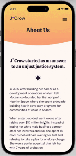
About Us
J*CROW'S STORY
Kelli Morgan (founder) shares her story of starting J*Crow and what she hopes the brand will do for women who are deeply affected by U.S. criminal justice system


Constraints
Key Takeaways
Next Steps
FINAL THOUGHTS
Takeaways
Creating this website zero to one emphasized the importance of iteration and prioritizing interview feedback. A key component to making decisions for the visual design was team discussion backed by the WCAG contrast & accessibility standards. This project also brought forth the significance of quickly adapting to new information we received from our client and J*Crow investors. The opportunity to work on this team was especially rewarding because we had to overcome many obstacles together through virtual communication and closely analyze the marginalized Women of Color community; our goal was to address their economic needs to promote equity within society.
QUICK ACCOMODATION
———————————————
J*Crow's brand & program were still developing in tandem with building the website. There were times when we had to quickly backtrack and update the overall design and information.
USER INTERVIEWS
———————————————
Conducting user interviews and getting feedback from various users and stakeholders helped to make the UX smoother and user flow more intuitive.
FUNCTIONAL FEATURES———————————————
Some of the program features were not fully developed, so the buttons led to dead ends; linking the buttons so that they navigate to different pages would've helped finalize the website completely.
INFORMATION
ARCHITECTURE
The main purpose of the website is to educate stakeholders about the J*Crow's program. Our designers had to make sure that the website did not overload the user with information. Based on the usability interviews, we made several adjustments to the IA so that the user flows were intuitive.

COMPETITIVE
ANALYSIS
Defy Ventures
clear calls-to-action
use of inclusive language in navigation using “our” to evoke a sense of togetherness
brand colors of orange and black categorize the incarcerated community
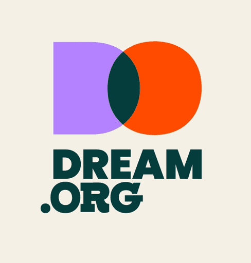
Dream.org
key services/features are broken down into 3 categories
large organization + action-oriented—advocating for new legislation, creating green jobs, and teaching low-income children
device-responsive design
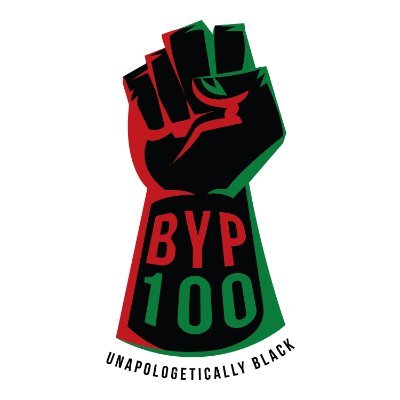
Black Youth Project 100
transformative movement campaign to end the different forms of gender violence
does not show actionable results


Completing an audit of 12 non-profit organizations, we detailed everything from their design choices, information architecture, provided resources, and more. In websites that were catered to incarcerated communities, colors like orange and black were often used. We wanted to create an experience that appeared less intense and seemed more approachable to ensure more of the community felt supported in taking the financial chance of starting their own business.
USABILITY INTERVIEWS
Our team performed usability interviews with stakeholders to gauge how users first interact with the website and understand its shortcomings. Each responses were heavily taken into consideration because we wanted to fulfill our users' needs and accurately develop our solution to provide resources for our target audience groups.
"[I suggest] spending more time thinking about how to balance seriousness and playfulness."
"[I suggest] spending more time thinking about how to balance seriousness and playfulness."
"[I suggest] spending more time thinking about how to balance seriousness and playfulness."
"My feedback is all geared towards how to better communicate the content → visual alignment, colour, contrast, visibility and usability."
"My first impression is that there's too much text…should make it more readable to understand the message right away."
———————————————
Women of Color disproportionately impacted by racial profiling, mass incarceration, and police brutality.
———————————————
Black girls, women, and non-binary individuals affected by rape culture, misogyny, and systemic injustice.
———————————————
Individuals facing health complications and economic barriers due to insufficient support systems.


TARGET AUDIENCE
STYLE GUIDE
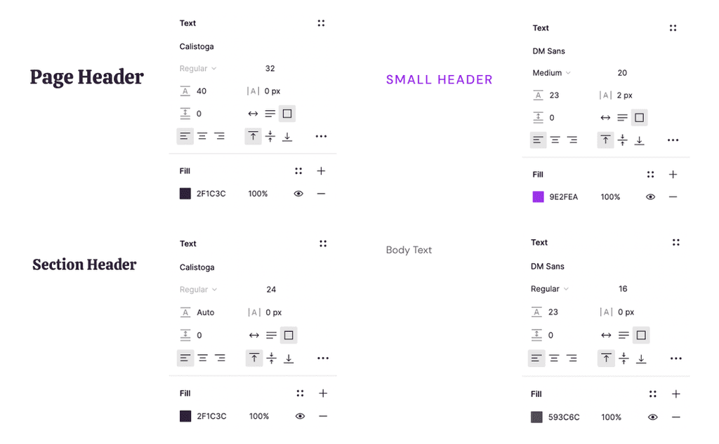
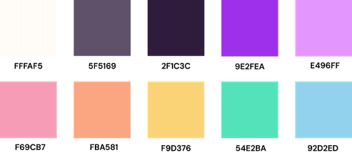
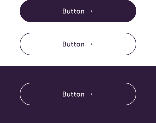
Our team went through multiple versions of design systems to meet the WCAG contrast and accessibility standards while upholding both a professional and friendly appearance.
ROLE
Co-Product & Design Manager
TIMELINE
May 2024 - Aug 2024
TOOLS
Figma, Notion
TEAM
2 Product/Design Manager
6 Designers
J*Crow is a non-profit organization dedicated to advancing economic justice for Black women and Women of Color impacted by the U.S. criminal justice system. In partnership with Develop for Good, I led the product and design process to deliver a responsive website that supports users through education, application, and community resources.
As the Co-Product & Design Manager, I worked closely with the founder to translate her vision into a scalable, accessible digital platform.
J*Crow
Designing for economic justice and empowerment.